


Library under development. Backward compatibility not guaranteed before version 1.0.
Dependencies
To use pie charts with Material Design styles in an Android project, include the following dependency:
dependencies {
    implementation "it.czerwinski.android:charts-piechart-material:$android_charts_version"
}
See also pie charts documentation.
Styles
All styles should work equally fine with both light and dark themes. Colors are determined based on theme attributes:
colorPrimary, colorPrimaryVariant, colorOnSurface, colorOnPrimarySurface.
Common Attributes
| Attribute | Value |
|---|---|
android:gravity |
center |
pieChart_rotationAngle |
270 (top) |
pieChart_dataSetInterpolator |
@android:anim/decelerate_interpolator |
pieChart_dataSetAnimationDuration |
300 (milliseconds) |
pieChart_selectionInterpolator |
@android:anim/decelerate_interpolator |
pieChart_selectionAnimationDuration |
300 (milliseconds) |
pieChart_labelsUI |
SimplePieChartLabelsUI |
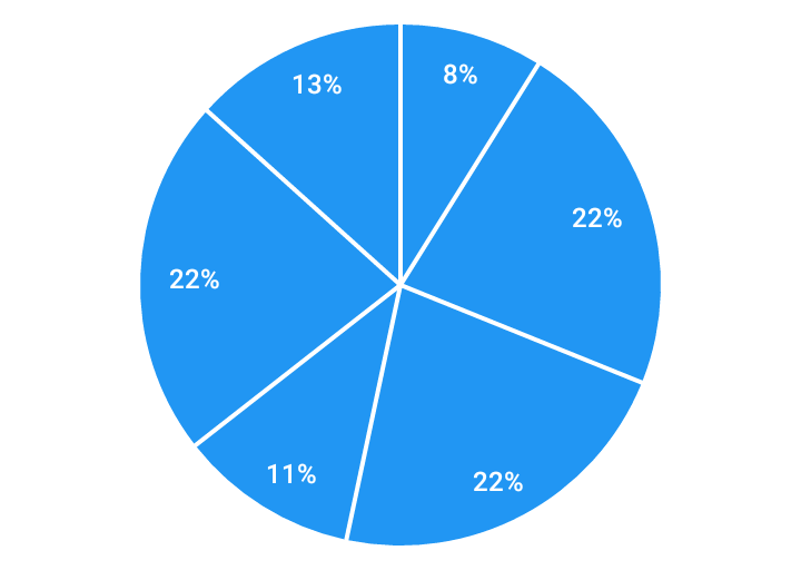
Pie Chart – Labels Inside
Style: AndroidCharts.Material.PieChart.Simple.LabelsInside
| Attribute | Value |
|---|---|
pieChart_ui |
SimplePieChartUI |
pieChart_uiAppearance |
AndroidCharts.Material.PieChart.SimpleUI |
pieChart_labelsAppearance |
AndroidCharts.Material.PieChart.Labels.InsideSlice |
UI appearance:
| Attribute | Value |
|---|---|
simplePieChartUI_colors |
ColorStateList |
simplePieChartUI_shadowColor |
#44000000 (black 27% opacity) |
simplePieChartUI_sliceSpacing |
2dp |
simplePieChartUI_selectionShift |
8dp |
simplePieChartUI_selectionElevation |
3dp |
Colors:
| State | Color |
|---|---|
state_selected="false" |
?attr/colorPrimary |
state_selected="true" |
?attr/colorPrimaryVariant |
Labels appearance:
| Attribute | Value |
|---|---|
simplePieChartLabelsUI_textAppearance |
AndroidCharts.Material.TextAppearance.Label.Inside |
simplePieChartLabelsUI_labelPosition |
inside |
simplePieChartLabelsUI_labelSpacing |
24dp |
simplePieChartLabelsUI_labelMinPercent |
5 |
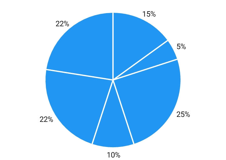
Pie Chart – Labels Outside
Style: AndroidCharts.Material.PieChart.Simple.LabelsOutside
| Attribute | Value |
|---|---|
pieChart_ui |
SimplePieChartUI |
pieChart_uiAppearance |
AndroidCharts.Material.PieChart.SimpleUI |
pieChart_labelsPaddingFromText |
100% |
pieChart_labelsAppearance |
AndroidCharts.Material.PieChart.Labels.Outside |
UI appearance:
| Attribute | Value |
|---|---|
simplePieChartUI_colors |
ColorStateList |
simplePieChartUI_shadowColor |
#44000000 (black 27% opacity) |
simplePieChartUI_sliceSpacing |
2dp |
simplePieChartUI_selectionShift |
8dp |
simplePieChartUI_selectionElevation |
3dp |
Colors:
| State | Color |
|---|---|
state_selected="false" |
?attr/colorPrimary |
state_selected="true" |
?attr/colorPrimaryVariant |
Labels appearance:
| Attribute | Value |
|---|---|
simplePieChartLabelsUI_textAppearance |
AndroidCharts.Material.TextAppearance.Label.Outside |
simplePieChartLabelsUI_labelPosition |
outside |
simplePieChartLabelsUI_labelSpacing |
-4dp |
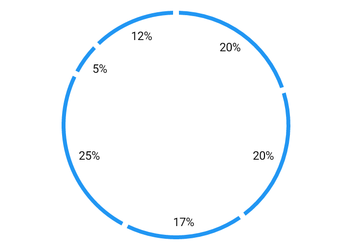
Donut Chart – Labels Inside
Style: AndroidCharts.Material.PieChart.Donut.LabelsInside
| Attribute | Value |
|---|---|
pieChart_ui |
DonutPieChartUI |
pieChart_uiAppearance |
AndroidCharts.Material.PieChart.SimpleUI |
pieChart_labelsAppearance |
AndroidCharts.Material.PieChart.Labels.Inside |
UI appearance:
| Attribute | Value |
|---|---|
donutPieChartUI_colors |
ColorStateList |
donutPieChartUI_shadowColor |
#44000000 (black 27% opacity) |
donutPieChartUI_donutWidth |
4dp |
donutPieChartUI_donutSpacing |
6dp |
donutPieChartUI_selectionWidth |
4dp |
donutPieChartUI_selectionShift |
8dp |
donutPieChartUI_selectionElevation |
3dp |
Colors:
| State | Color |
|---|---|
state_selected="false" |
?attr/colorPrimary |
state_selected="true" |
?attr/colorPrimaryVariant |
Labels appearance:
| Attribute | Value |
|---|---|
simplePieChartLabelsUI_textAppearance |
AndroidCharts.Material.TextAppearance.Label.Outside |
simplePieChartLabelsUI_labelPosition |
inside |
simplePieChartLabelsUI_labelSpacing |
24dp |
simplePieChartLabelsUI_labelMinPercent |
5 |
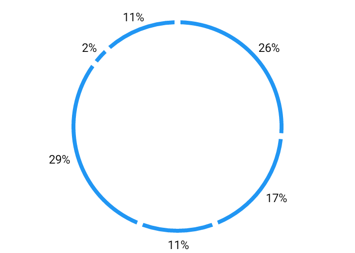
Donut Chart – Labels Outside
Style: AndroidCharts.Material.PieChart.Donut.LabelsOutside
| Attribute | Value |
|---|---|
pieChart_ui |
DonutPieChartUI |
pieChart_uiAppearance |
AndroidCharts.Material.PieChart.SimpleUI |
pieChart_labelsPaddingFromText |
100% |
pieChart_labelsAppearance |
AndroidCharts.Material.PieChart.Labels.Outside |
UI appearance:
| Attribute | Value |
|---|---|
donutPieChartUI_colors |
ColorStateList |
donutPieChartUI_shadowColor |
#44000000 (black 27% opacity) |
donutPieChartUI_donutWidth |
4dp |
donutPieChartUI_donutSpacing |
6dp |
donutPieChartUI_selectionWidth |
4dp |
donutPieChartUI_selectionShift |
8dp |
donutPieChartUI_selectionElevation |
3dp |
Colors:
| State | Color |
|---|---|
state_selected="false" |
?attr/colorPrimary |
state_selected="true" |
?attr/colorPrimaryVariant |
Labels appearance:
| Attribute | Value |
|---|---|
simplePieChartLabelsUI_textAppearance |
AndroidCharts.Material.TextAppearance.Label.Outside |
simplePieChartLabelsUI_labelPosition |
outside |
simplePieChartLabelsUI_labelSpacing |
-4dp |