


Library under development. Backward compatibility not guaranteed before version 1.0.
Dependencies
To use pie charts in an Android project, include the following dependencies:
dependencies {

    // Pie Charts dependency:
    implementation "it.czerwinski.android:charts-piechart:$android_charts_version"

    // Material Design styles for Pie Charts:
    implementation "it.czerwinski.android:charts-piechart-material:$android_charts_version"
}
See also Material Design styles for pie charts.
Layout
To add a pie chart to a layout, use a PieChart view:
<it.czerwinski.android.charts.piechart.PieChart
    android:id="@+id/pieChart"
    android:layout_width="match_parent"
    android:layout_height="match_parent" />
Never use wrap_content to determine the size of a PieChart. This value will set the size to 0dp.
Instead, you may use layout_constraintHeight_percent attribute of a ConstraintLayout.
Styling
Available Attributes
Pie Chart
PieChart view has the following attributes:
| Attribute | Description |
|---|---|
android:padding |
View padding |
android:gravity |
Gravity of the pie chart inside the view |
pieChart_rotationAngle |
Rotation angle of the pie chart (start angle of the first slice) |
pieChart_dataSetInterpolator |
Interpolator for data set changes animation |
pieChart_dataSetAnimationDuration |
Duration of data set changes animation (in milliseconds) |
pieChart_selectionInterpolator |
Interpolator for slice selection animation |
pieChart_selectionAnimationDuration |
Duration of slice selection animation (in milliseconds) |
pieChart_ui |
Name of a class implementing PieChart.UI |
pieChart_uiAppearance |
Style for the PieChart.UI |
pieChart_labelsPaddingHorizontal |
Additional horizontal padding for labels |
pieChart_labelsPaddingVertical |
Additional vertical padding for labels |
pieChart_labelsPaddingFromText |
Text to be measured to determine as padding for labels |
pieChart_labelsUI |
Name of a class implementing PieChart.LabelsUI |
pieChart_labelsAppearance |
Style for the PieChart.LabelsUI |
Simple Pie Chart UI
Set pieChart_ui to it.czerwinski.android.charts.piechart.SimplePieChartUI.
SimplePieChartUI has the following attributes:
| Attribute | Description |
|---|---|
simplePieChartUI_colors * |
A single color state list or an array of state lists for pie chart slices |
simplePieChartUI_shadowColor |
Pie chart slice shadow color |
simplePieChartUI_sliceSpacing |
Pie chart slice spacing |
simplePieChartUI_selectionShift |
Outwards shift distance of a selected slice |
simplePieChartUI_selectionElevation |
Elevation of a selected slice |
*) See also Defining Lists Of Colors.
Donut Pie Chart UI
Set pieChart_ui to it.czerwinski.android.charts.piechart.DonutPieChartUI.
DonutPieChartUI has the following attributes:
| Attribute | Description |
|---|---|
donutPieChartUI_colors * |
A single color state list or an array of state lists for donut chart slices |
donutPieChartUI_shadowColor |
Donut chart slice shadow color |
donutPieChartUI_donutWidth |
Donut width |
donutPieChartUI_donutSpacing |
Pie chart slice spacing |
donutPieChartUI_selectionWidth |
Width of a selected donut slice |
donutPieChartUI_selectionShift |
Outwards shift distance of a selected slice |
donutPieChartUI_selectionElevation |
Elevation of a selected slice |
*) See also Defining Lists Of Colors.
Simple Pie Chart Labels UI
Set pieChart_ to it.czerwinski.android.charts.piechart.SimplePieChartLabelsUI.
SimplePieChartLabelsUI has the following attributes:
| Attribute | Description |
|---|---|
simplePieChartLabelsUI_textAppearance |
Text appearance as defined in charts-core |
simplePieChartLabelsUI_labelPosition |
Labels position, inside or outside the chart |
simplePieChartLabelsUI_labelSpacing |
Labels spacing from the edge of the pie chart |
simplePieChartLabelsUI_labelMinPercent |
Minimum slice value in percent to display a label |
Provided Styles
See also Material Design styles.
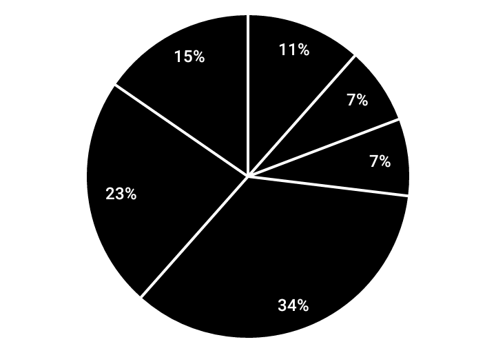
Pie Chart – Light Theme
Style: AndroidCharts.PieChart.Simple.LightTheme
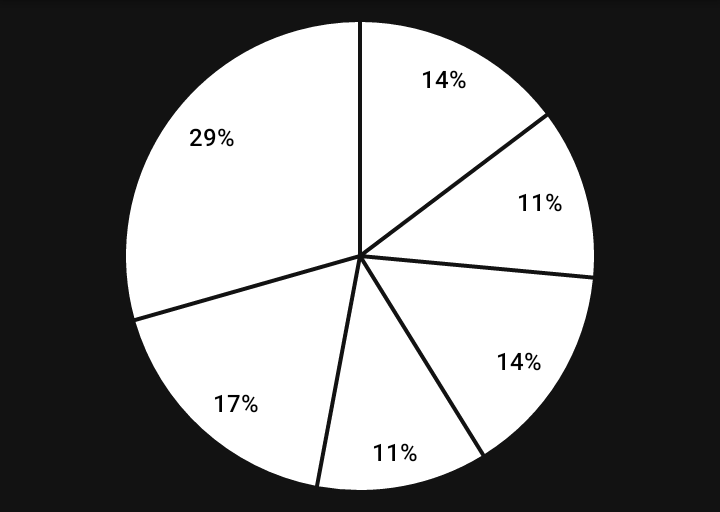
Pie Chart – Dark Theme
Style: AndroidCharts.PieChart.Simple.DarkTheme
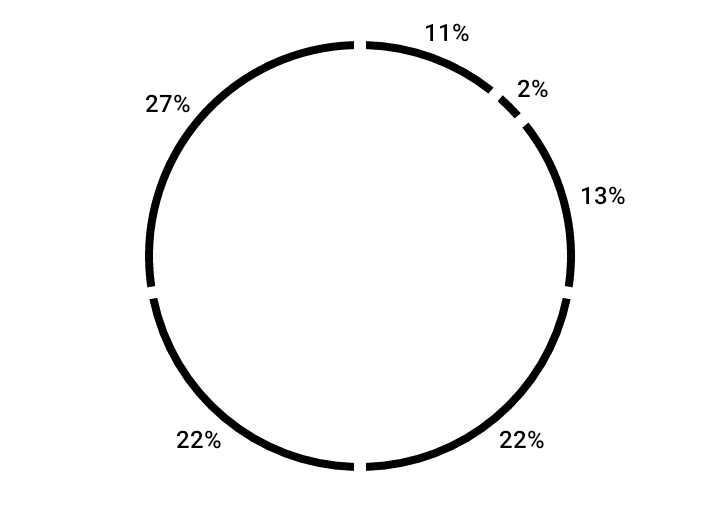
Donut Chart – Light Theme
Style: AndroidCharts.PieChart.Donut.LightTheme
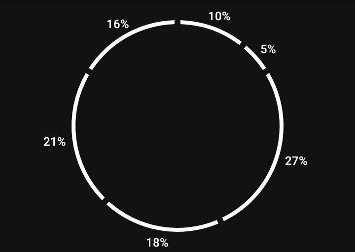
Donut Chart – Dark Theme
Style: AndroidCharts.PieChart.Donut.DarkTheme
Custom UI
To define a custom style for PieChart, you can create your own implementation
of PieChart.UI and/or PieChart.LabelsUI.
Data Set Adapters
Provided Adapters
There are data set adapters provided for basic types:
IntListPieChartAdapterLongListPieChartAdapterFloatListPieChartAdapterDoubleListPieChartAdapter
Usage:
val adapter = FloatListPieChartAdapter(requireContext())
pieChart.adapter = adapter

adapter.data = listOf(0.1f, 0.2f, 0.3f)
Custom Adapters
It is also possible to define a custom data set adapter for any data type, e.g.:
data class MyData(
    val name: String,
    val amount: Int
)
A data set adapter can be defined as:
class CustomPieChartAdapter : PieChart.DataSetAdapter() {

    var data: List<MyData> = emptyList()
        set(value) {
            field = value
            notifyDataSetChanged()
        }

    override val size: Int get() = data.size
    override val sum: Float get() = data.sumBy { it.amount }.toFloat()
    override fun get(index: Int): Float = data[index].amount.toFloat()
    override fun getLabel(index: Int): String = data[index].name
}